British Rail logo designer appalled by green makeover mess [The Guardian]
Date: 22/09/2021
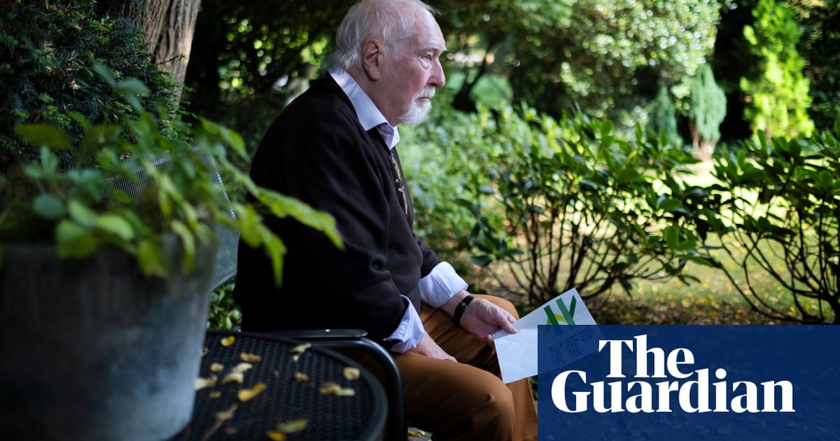
Gerry Barney says updated branding, to be used by Great British Railways, uses too many colours. The designer of the familiar British Rail logo has warned against government plans to revamp the symbol and dismissed an attempt to give it a green makeover as a 'load of old b******s'. The transport secretary, Grant Shapps, has said his plans for the new Great British Railways will involve 'updated versions of the classic 'double-arrow' logo' when the system is launched next year.
External links
The Guardian
Gerry Barney says temporary branding update by rail industry group uses too many colours
Related images

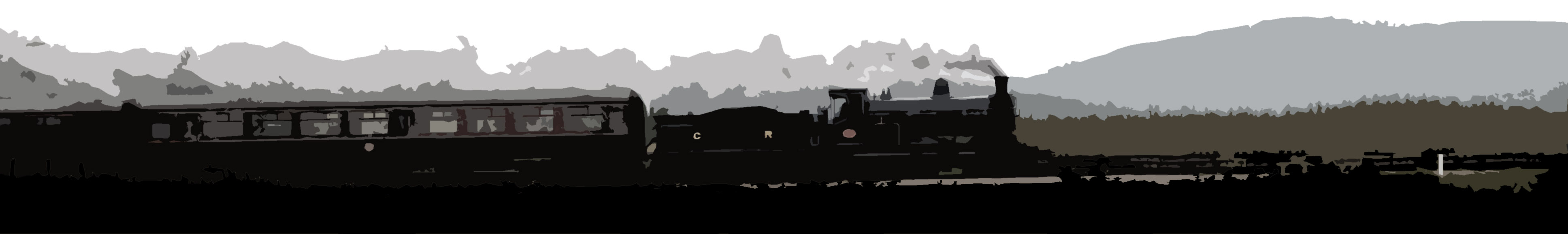
Location: Nethertown
Company: Whitehaven and Furness Junction Railway
08/03/2018 Mark Bartlett
Related news items
Tags: x British Rail x British Rail Logo x Gerry x Barney x Great British Railways x British Rail Double Arrow